The original logo for Pagecord was created in haste because I built the first version of the app in just three days in March last year. I say logo, but all I did was type the word "Pagecord" in the Literata font and mangled it in Figma:
I didn't have a "mark" for this logo, so I just took the "P" and used that. This wasn't ideal, but it was good enough for a side project.
A few weeks ago I decided it was time to improve things. Pagecord had turned a profit, so I invested some of the funds and hired a professional designer – the fantastic Alex Birks.
My brief was fairly simple:
Iconography that relates to the product like a pencil, a page, maybe page cord itself
A pop of colour
A serif font
A "mark" or "icon" that could be used for social media and the favicon
Something fun and playful, not corporate and bland
We had a chat to discuss a mood board, then I sent over some more thoughts and other brands that I liked. Alex then came up with 5 distinct logo concepts, each of which had its own merits, but there was one that really connected with me from the start.
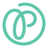
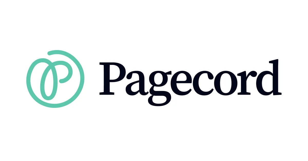
The icon I liked most was based on the @ symbol, but used a "p" instead of an "a". One of Pagecord's unique features is the ability to blog by email and @ is synonymous with email. I thought this was brilliant!
The icon worked really well alongside a new serif font, but the original colour of the logo was coral and this had a bit of an Airbnb vibe to it. We tried variants in blue (too corporate) and orange (too Substack), and finally settled on a mint flavour which hit a perfect balance.
I'm absolutely thrilled with it!
The Pagecord home page, some of the app UI and the transactional emails have been updated to reflect this new branding. There's still a bit of work to do, including a new default theme for new Pagecord blogs and ordering some Pagecord merch, but that will come later.