
I decided to add a sort toggle to the Pages section, which led me to spend the afternoon tidying up the Pagecord admin UI.
I think it's a lot better now, more intentional, more minimal, with fewer things in the way. I love adding features to Pagecord, but making things simpler is even better.
Here's what's changed.
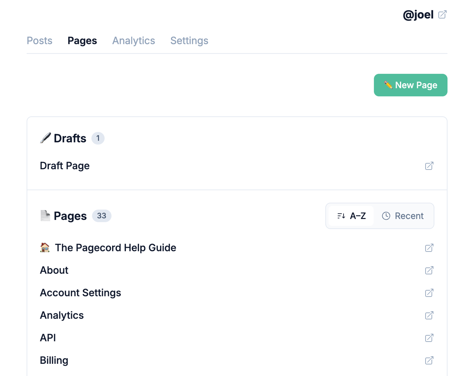
Sort pages alphabetically, or by most recently updated
The default is to sort alphabetically, with the Home Page (if you have one) at the top. Now you can sort them all by updated at time. This option persists when you return.
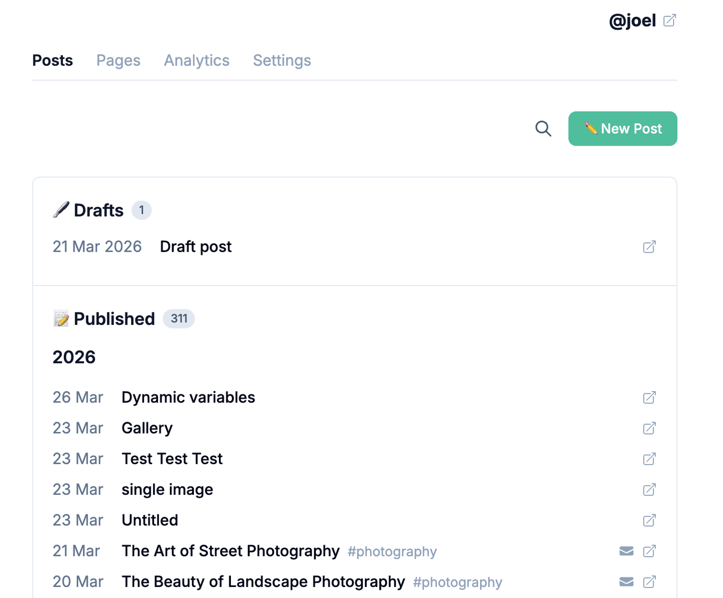
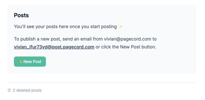
A simpler Posts page
There's no 'callout' at the top of this page right now. The post count is now visible in each section (Drafts and a new Published section). When you search, the number of search results is now also visible.
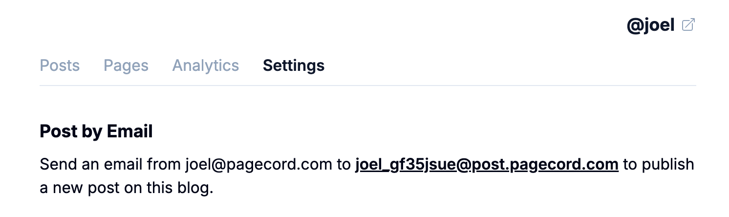
Post by email details
The Settings page used to have a callout that gave you your blog URL, as well as info about posting by email. This wasn't the right place for that info. Info about posting by email is now in a new Post by Email section in Blog Settings. The URL of your blog can be found by clicking on the blog name in the top-right, as you've always been able to do.

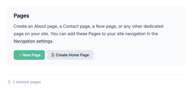
Blank Slates
If you don't have any posts or pages, the "blank slate" screens are a bit more informative. They can definitely be improved further, but this is a start.
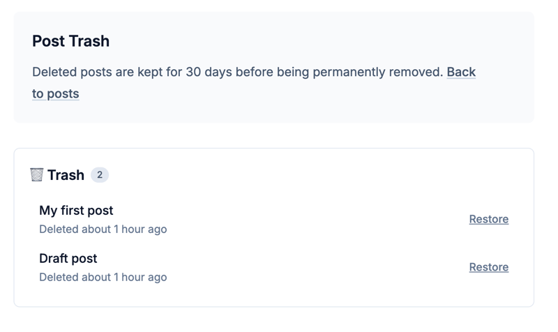
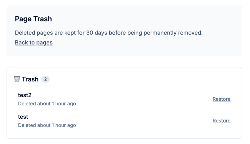
Trash cans
The posts and pages trash areas have also been tweaked following this new (sort of) design system.
Hopefully you'll agree this is an improvement and not a who moved my cheese? moment!
Feedback, as always, is very welcome.